In preparation for my meeting with the creative design team from Different Perspective Marketing on Wednesday, I’ve been spending most of the evening researching authors’ blogs, websites, and various online writing resources, trying to decide what I like.
That’s like trying to put a net around a cloud. I like everything. I can also find a fault in everything that I like. How exactly do I take something so nebulous and undefined and package it into a description of how I want to represent my brand? Yikes.
I’m a very bubbly person, so I want to encompass that element of my personality into my logo and branding. On the other hand, I don’t want to end up with rainbows and unicorns on my website. I love bright, feminine colors, but I don’t want everyone to feel that I’m limited to writing for tweens and Care Bear lovers, either. Grrrr. This is complicated!
I’ve decided to take a look at some of the logos of my favorite writer’s blogs/websites and share them here, explaining what I like and don’t like about each. Perhaps I can just direct the Creative Design team to this blog post when I’m done.

Simple and to the point, I appreciate this logo for the fact that I know immediately that it represents a writer without any other text or indication.
The downside to this logo is that it’s so plain. The same thing I love about it – it’s simplicity – is also what turns me off from mimicking this style. It’s a bit boring.
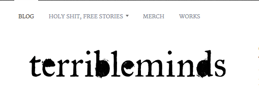
This is another example of a logo that catches my eye but bores me within a second. I love the font but nothing draws me in. No graphic, no personality. Just a catchy text and name that conveys information with little resonance. A great blog, however, with witty and brash humor that often makes me blush.
I don’t know how I feel about actually being a PART of my graphic. While I want my readers to know me, I’m not sure if I want to have to see my face branded on everything that I’ve touched. I want a logo that is versatile and that I won’t mind seeing on my blog, my business cards, my website, etc. As cute as I am, I’m not sure I want to lounge across an old trunk in a grass field with my Macbook Pro. Just sayin’.
![OK, this is by far my favorite. A little egocentric [yay, picture of the author] but still focused on the writing, not the writer. If he hadn't already used this as his logo, I'd totally yank it.](https://victoriaelizabethann.com/wp-content/uploads/2013/01/screen-shot-2013-01-20-at-8-13-42-pm.png?w=700)
OK, this is by far my favorite. A little egocentric [yay, picture of the author] but still focused on the writing, not the writer. If he hadn’t already used this as his logo, I’d totally yank it.
This is the coolest logo. Awesome typewriter [can you tell I have a thing for them?] and the play on nature. Plus an artsy-fartsy portrait of the writer. As much as I just said I don’t want to be in my logo, I think this is a tasteful way of doing it. If we did this exact same shot with a pink typewriter, I’d be sold.
Oh, lookie, I found a typewriter:
Things I like:
- Rich colors, such as purples, blues, pinks, and greens. I’m not a big fan of yellow and orange. Most of the logos that had yellow and orange didn’t make the cut for this blog, so chances are I probably won’t like them as part of my branding package.
- Typewriters and plays on writing instruments. Pens, pencils, notepads.
- Nature. I feel this conveys my happy disposition without seeming juvenile or childlike.
- Modern takes on classic concepts. I love the fancy lettering used in fairy tales, so I wouldn’t mind a modern/creative take on that.
Things I don’t like:
- Corny or cliched phrases, graphics, or plays on words.
- Brown tones of any kind. It just seems too morose for my personality.
- Self-portraits unless they are very tastefully done. Out of all the ones I viewed, I really only liked Jeff Goins’ logo.
- Comic Sans font. Really, this should have been outlawed in 1998.
Well, that’s as far as I’ve gotten in my research. Hopefully this gives the amazing team at Different Perspective Productions a good starting ground for what I’m looking for in terms of personal branding. They have an incredibly talented staff, so I’m sure they can do a much better job at visually interpreting my thoughts than I can!
Optimistic for a great meeting on Wednesday!
~ Victoria Elizabeth Ann


It seems like the list at the end will be very helpful for making decisions. Good luck and know that it is not permanent.
–JW
LikeLike
Thank you! That’s the big thing I need to remember: I can CHANGE my brand. I just fear being pigeon-holed so much so that I let that fear bleed into other areas. I appreciate your advice!
LikeLike